
How to Use Gutenberg Block Editor Like a Pro
When WordPress switched from the old Classic Editor to Gutenberg, I genuinely hated it for the first few weeks. I remember trying to write a simple blog post and accidentally creating like six different blocks for what should’ve been one paragraph. I’d hit enter, a new block would appear, I’d try to move an image, and somehow the whole layout would shift in ways I didn’t intend.
I actually installed the Classic Editor plugin just to avoid dealing with Gutenberg for almost a year. Looking back, that was a mistake — not because Gutenberg is perfect, but because once I actually sat down and learned how it works, it became one of the more efficient ways I’ve written content.
If you’re currently in that “I just want my old editor back” phase, I get it. But stick with me here, because once a few things click, Gutenberg genuinely speeds up your workflow instead of fighting against it.
What Gutenberg Actually Is (Without the Technical Jargon)
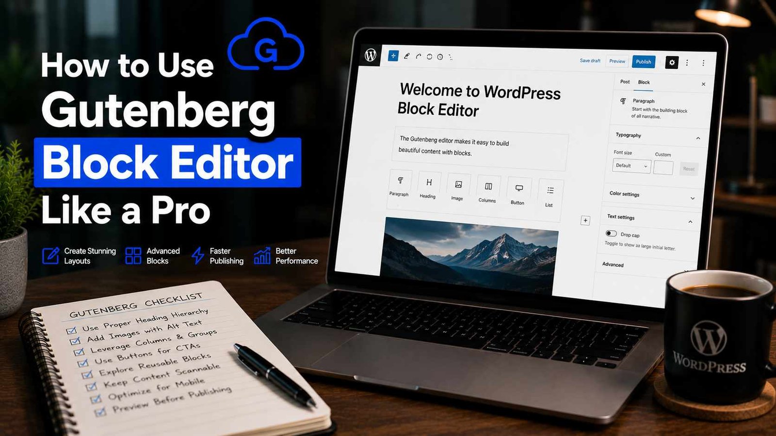
Gutenberg is WordPress’s block-based editor. Instead of writing everything in one big text box like the old Classic Editor, every piece of content — a paragraph, an image, a heading, a button, a quote — is its own individual “block” that you can move, style, and edit independently.
Think of it less like a Word document and more like building with Lego pieces. Each block does one specific thing, and you snap them together to build your final page or post.
Once I stopped trying to use it like the old editor and started actually thinking in blocks, things got a lot easier.
Step 1: Get Comfortable With the Basic Blocks First
Don’t try to learn every single block type right away — there are dozens, and most people only regularly use a handful.
The blocks I use constantly:
- Paragraph — your basic text block, used for most of your writing
- Heading — for your H2s, H3s, etc., which matter both for readability and SEO
- Image — for adding photos, with built-in options for alignment and captions
- List — bullet points or numbered lists
- Quote — for pull quotes or testimonials
- Button — useful for calls-to-action, like “Read More” or “Get Started”
- Columns — lets you create side-by-side layouts without touching any code
If you only learn these seven, you can build the vast majority of standard blog content without ever feeling stuck.
Step 2: Learn the Slash Command (This Changed Everything for Me)
Here’s the single biggest productivity boost I picked up, and I wish someone had shown me this on day one.
Instead of clicking the little “+” icon every time you want to add a new block, just type “/” followed by the block name directly in your content area. Type /heading and hit enter, and it instantly creates a heading block. Type /image, and it pulls up the image block ready to upload.
This alone cut my writing time down noticeably because I wasn’t constantly reaching for my mouse to click through menus. Once your fingers get used to it, it becomes pretty automatic.
Step 3: Understand Block Settings (The Sidebar You’re Probably Ignoring)
When you click on any block, look at the right-hand sidebar — this is where the real customization happens, and it’s something I completely ignored for months when I started.
For a paragraph block, you can adjust text color, background color, font size, and spacing. For an image block, you control alignment, size, alt text (important for SEO, don’t skip this), and links.
I used to manually try to resize images by dragging corners, which often distorted them awkwardly. Once I started using the dimension settings in the sidebar instead, my images came out properly sized every time.
Step 4: Master Block Movement (Drag, Keyboard, or Menu)
Rearranging content used to be one of my biggest frustrations. Here are the three ways to move blocks around, and honestly, I use all three depending on the situation:
Drag and drop — Click and hold the six-dot icon on the left side of a selected block, then drag it where you want. Works fine for small adjustments, but can get fiddly with longer posts.
Keyboard shortcuts — Select a block, then use Shift + Alt + T to move it up, or Shift + Alt + Y to move it down (on Windows; Mac uses similar Option-based shortcuts). This became my go-to method once I learned it, especially for longer articles where dragging blocks across the screen gets annoying.
The three-dot menu — Click the three dots on a selected block, and you’ll find “Move Up” and “Move Down” options. Useful when you just need to nudge something by one or two positions.
Step 5: Use Reusable Blocks for Repeated Content
This one genuinely saved me hours over time. If you find yourself adding the same content block repeatedly — like a newsletter signup section, a specific disclaimer, or a styled call-to-action — you can save it as a Reusable Block.
Here’s how: create the block exactly how you want it, click the three-dot menu, and select “Add to Reusable Blocks.” Give it a name. Now, anytime you need it again, just search for it using the slash command or block inserter, and it drops in fully formatted.
I use this for my affiliate disclosure box and my “Quick Summary” boxes that I add near the top of certain guide-style posts. Updating the reusable block once updates it everywhere it’s used — which is incredibly useful if you ever need to change wording across dozens of posts at once.
Step 6: Get Familiar With Columns and Groups for Better Layouts
For a long time, my posts were just a straight vertical stack of paragraphs and images — which works, but can feel a bit flat for certain content types.
The Columns block lets you split content side-by-side, which I use a lot for comparison sections (like putting two product features next to each other) or for pairing an image with text in a more magazine-style layout.
The Group block lets you bundle multiple blocks together, which is useful when you want to apply a background color or spacing to a whole section at once, rather than styling each block individually.
Step 7: Use Patterns to Speed Up Common Layouts
Patterns are pre-designed combinations of blocks — think of them as templates for specific sections, like a “call to action” layout or a “team member” grid.
You can access these by clicking the block inserter (the “+” icon) and switching to the “Patterns” tab. Many WordPress themes, including Astra and GeneratePress, come with their own pattern libraries built in.
I don’t use patterns constantly, but when I’m building a more visually complex landing page rather than a standard blog post, starting from a pattern instead of an empty page saves a significant amount of setup time.
A Real Workflow Example
Here’s roughly how I write a typical blog post now using Gutenberg, start to finish:
I start by typing my title, then immediately use /heading to drop in my main H2 sections as a rough outline — this helps me see the structure before I’ve written a single sentence of actual content.
Then I go section by section, writing paragraph content under each heading, using the slash command to insert images, quotes, or lists where needed.
Near the end, I drop in my reusable “Quick Summary” block near the top (yes, after writing the content — easier to summarize something once it exists), and my affiliate disclosure reusable block wherever relevant.
Finally, I scroll through using the block list view (the icon in the top-left that looks like a list) to check my overall structure at a glance, making sure my headings are properly nested and nothing’s out of order.
This entire process, for a roughly 1,500-word post, usually takes me a fraction of the time it used to when I was fighting with the editor instead of working with it.
Common Mistakes I Made (And See Others Make)
Pressing Enter constantly and creating dozens of unnecessary blocks. Each paragraph doesn’t need to be its own separate block if it’s part of one continuous thought — though splitting into separate blocks does make rearranging easier later, so this one’s partly a personal preference.
Ignoring alt text on images. This is easy to skip when you’re moving fast, but it matters for both accessibility and SEO. Make it a habit to fill this in every time you add an image.
Not using heading blocks properly. I used to just make text bold and bigger to “look like” a heading instead of using actual Heading blocks. This is bad for SEO and accessibility — search engines and screen readers rely on actual heading tags (H2, H3, etc.), not just visual styling.
Overusing custom colors and fonts. Early on, I went a little overboard styling individual blocks with different colors, thinking it looked more interesting. It just made my posts look inconsistent and a bit chaotic. Stick to a simple, consistent style guide.
Forgetting to save reusable blocks for repeated content. If you’re copying and pasting the same section into multiple posts, that’s your sign to convert it into a reusable block instead.
Not checking how the post looks in preview before publishing. Gutenberg’s editor view doesn’t always perfectly match the live site, especially with certain themes. Always hit “Preview” before hitting publish.
Final Thoughts
Gutenberg took me way longer to warm up to than it probably should have, mostly because I kept trying to use it like the old Classic Editor instead of learning how it actually wants to be used. Once I leaned into the block-based way of thinking — slash commands, reusable blocks, proper use of headings and columns — it genuinely became faster and more flexible than what I was used to before.
If you’ve been avoiding it or quietly resenting it every time you sit down to write a post, give it one more real shot using the tips above. It’s not as intimidating once a few of these habits become second nature, and honestly, going back to the old editor now would probably slow me down more than Gutenberg ever did.
Any Question? Contact Us
